Welcome to Teaching Students with Visual Impairments |
Print ComparisonsBy: Carmen Willings
teachingvisuallyimpaired.com Updated October 23, 2017 I use this environmental print comparison regularly to help team members understand the comparison between the acuity a student is able to visually access and how it relates to font sizes. Keep in mind that it is important to use the lowest font size a student is able to easily, accurately, and fluidly read for longer passages. Although a student may have a threshold for a smaller font, if they cannot read it with accuracy and fluency, it will not be an efficient font size for sustained reading. Near Vision Snellen Test ChartThe following is a list of environmental print that correlates to the acuity on a Near Vision Snellen Test Chart.
Information in the above chart was taken from the "Near Vision Test Chart" by the Low Vision Clinic, N.C. Memorial Hospital Dept. of Ophthalmology, University of North Carolina School of Medicine, Chapel Hill, NC.
Functional Distance Acuity ApproximationsThe following is is a list of Functional Distance Acuity Approximations at a distance of 20 feet.
Approximate Functional Vision AcuityAn approximation of functional visual acuity can be determined for students that are non-verbal or otherwise unable to perform for standard acuity assessment by comparing the size of the object the student can identify to the distance from the student. Although this can't be used as an exact measurement, it can provide you with an idea of the student's acuity.
Distance from the student:
Topor, I. (2004). Approximate functional visual acuity for different sizes of objects and distances. Chapel Hill, NC: Early Intervention Training Center for Infants and Toddlers With Visual Impairments, FPG Child Development Institute, UNC-CH. Visual Conditions Module 06/06/04 S4 Handout H
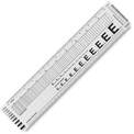
A typesetter ruler, like this C-Thru Flexible Typesetter’s Ruler, is made of clear plastic and has leading, type size, point rule, pica, point and inch scales. It will include font samples and rules of different sizes and more. Place it over your printed piece and match up the text in your sample with those printed on the ruler in order to get an estimate of the font size and line spacing and size of any rules in the design. APH's Newt kit includes this typesetter ruler!
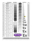
Recently, Carson Cochran, program manager at GIMC, shared a typometer pdf that was printed on clear acetate with me. By printing it on clear acetate, you can place the typometer over print to determine the font size. You can find a number of these available on Pinterest or by doing a Google search. Pictured is the Typometer that Carson provided me. What a great tool!
|
History of Visual Impairments
Professional Practice
Vision Professionals
Professionalism
Teacher Resources
Professional Publications
VI Book Resources
Family Resources
VI Referrals
Medical vision exams
visual diagnosis
fvlma
|
|
Teaching Students with Visual Impairments LLC
All Rights Reserved 
|