Welcome to Teaching Students with Visual Impairments |
Pictures & WorksheetsBy: Carmen Willings
teachingvisuallyimpaired.com Special attention needs to be given when selecting worksheets and materials for students with low vision. Students with low vision need to be provided with the highest quality worksheets and materials that provide good clarity and are accessible and appropriate for the student's unique visual needs. Picture UsePictures are used regularly in classrooms to convey information, illustrate points and make materials more visually appealing. Frequently text is dependent on the picture for meaning in early literacy books. When pictures are used that are critical to the text, it is important to pair the pictures with objects or models for students who have significant reduced vision and are unable to view pictures even when using low vision devices. A raised line drawing can be used if the student is able to understand two dimensional forms.
Selecting Worksheets and PicturesFor students with low vision, consider the quality of pictures when selecting worksheets or materials to use. Worksheets should be of good quality. In other words, if the lines are faded or the pictures are abstract, either use a different worksheet, or verbally identify the pictures for the students. Avoid worksheets where the ink has faded or print/ink has bled through when making copies of thin paged originals. Care also must be taken to be sure that students are provided with enough space to complete math computations or write their responses with larger print size.
Similarly, be sure to use teaching materials that are in a simple, bold font and of good visual clarity. Some older memory games and alphabet cards are still in circulation in many classrooms. These older games and cards frequently use obscure pictures of unfamiliar items to today’s students and consist of line drawings that are visually cluttered.
Look instead for uncluttered pictures with simple drawings or preferably photos of the object. Be sure that there is a good contrast and avoid dark printed letters on dark colors such as black on dark blue. Most phonics manipulatives are in a simple font and appropriate for students with low vision.
Figure-Ground ActivitiesAvoid figure ground activities (hidden pictures, word searches, etc.) unless they are part of a lesson in visual perception or using low vision devices to visually scan and locate pictures. Reading maps can be a challenging activity. The student may need an adapted map that only includes pertinent information.
Selecting Picture BooksSelect books with clear pictures and good visual contrast. Books should be colorful with simple pictures rather than pictures that are visually cluttered. If the book uses photographs, try to select books with a matted finish instead of glossy to reduce glare. Also look for books where the print is not written across the pictures, but instead, is placed on a solid background.
Material Suggestions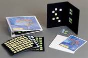
I like the Word PlayHouse kit from APH to teach beginning phonics and reading skills. The tiles are constructed of a durable plastic yet I have found some students, who are so inclined, can still bend the tiles. For those students, I use letter tiles commercially available, as they can be adapted by adding braille letters without obscuring the print. I then add Velcro to the back of the tile and present it on an APH Velcro board for high contrast and reduced clutter.
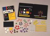
The Tri-fold Board from APH provides a great background to place words on for a word wall. I also like to use the Picture Maker Felt Board and texture strips when creating build-a-word and build-a-sentence activities. If you do not have access to Quota Funds, you can create your own felt board by purchasing foam back cloth (material you find on the ceiling of cars) from auto supply stores. This material is great as it doesn't get fuzzy like many flannel boards.
|
History of vi
Visual Impairments
Vi organizations & Agencies
VI book resources
VI Professionals
Professionalism
Instructional Planning
Professional Publications
Educational Programming
Individual Learning Differences
referrals
Medical vision exams
fvlma
additional evaluations
service planning
writing goals
compensatory skills
Guiding Principles Functional Skills Community Based Experiences Concepts to Teach Access to Instruction Organization & Study Skills Time Management Virtual Instruction Movies & Assemblies Lectures & Instruction Board Work (Chalk, White, etc.) Daily Schedule Morning Meeting Weather Check Dramatic Play Blocks Numbers & Counting Cranmer Abacus Instruction Algebra Geometry & Spatial Sense Measurement & Data Early Literacy Experiences Create Tactual Books Reading Instruction Reading Efficiency Science Adaptations Social Studies Adaptations Communication Modes Accessible Educational Materials Individual Schedules & Communication Cards Adjust Lighting Large Print Optical Devices for Near Optical Devices for Distance Optical Device Use Photocopying Font Legibility Increase Contrast Pictures & Worksheets Keyboarding Instruction Word Processing and Shortcuts Navigate Computer w/o a Mouse Braille Code Braille Instruction Braille Instruction Materials Writing Braille Summer Reading (braille) Signature & Handwriting Nemeth Braille Code Tactile Graphics Guidelines Creating Tactile Graphics Tactile Graphics Instruction Teacher Made Materials Labeling System assistive technology
Overview of Assistive Technology VI AT Resources Non-Optical Low Vision Devices Video Magnifiers Video Magnifier Instruction Screen Enlargement & Readers Low/Med. Tech Tactual Devices Notetaker Instruction Braillewriter Repair Tactile Graphics Technology Braille Technology Auditory Access Devices Accessing Audio Books iPads as Instructional Tools Making iOS Device Accessible iOS Accessibility Resources VoiceOver Apps for VI Note Taking apps Apps for Accessing Books Identification Apps Navigation & Location Apps Braille Apps Magnifier Apps Sound Making Apps Cause & Effect Apps Vision Skills Apps Apps for Early Learning Read to Me Story Apps Apps for Communication Android Apps for VI sensory efficiency
Sensory Input Encourage Use of Vision Sensory Area & Rooms Lightbox Use Sensory Activities for Students with Multiple Disabilities Sensory Tables Visual Efficiency Skills Visual Attend and Scan Activities Visual Tracking Activities Visual Discrimination Activities Visual Motor Activities Tactual Readiness Developing Skillful Hands Auditory Readiness Listening Skill Instruction independent living
orientation & Mobility
career education
recreation & Leisure
self determination
|
|
Teaching Students with Visual Impairments LLC
All Rights Reserved 
|